Tip #1: Bulk Rename
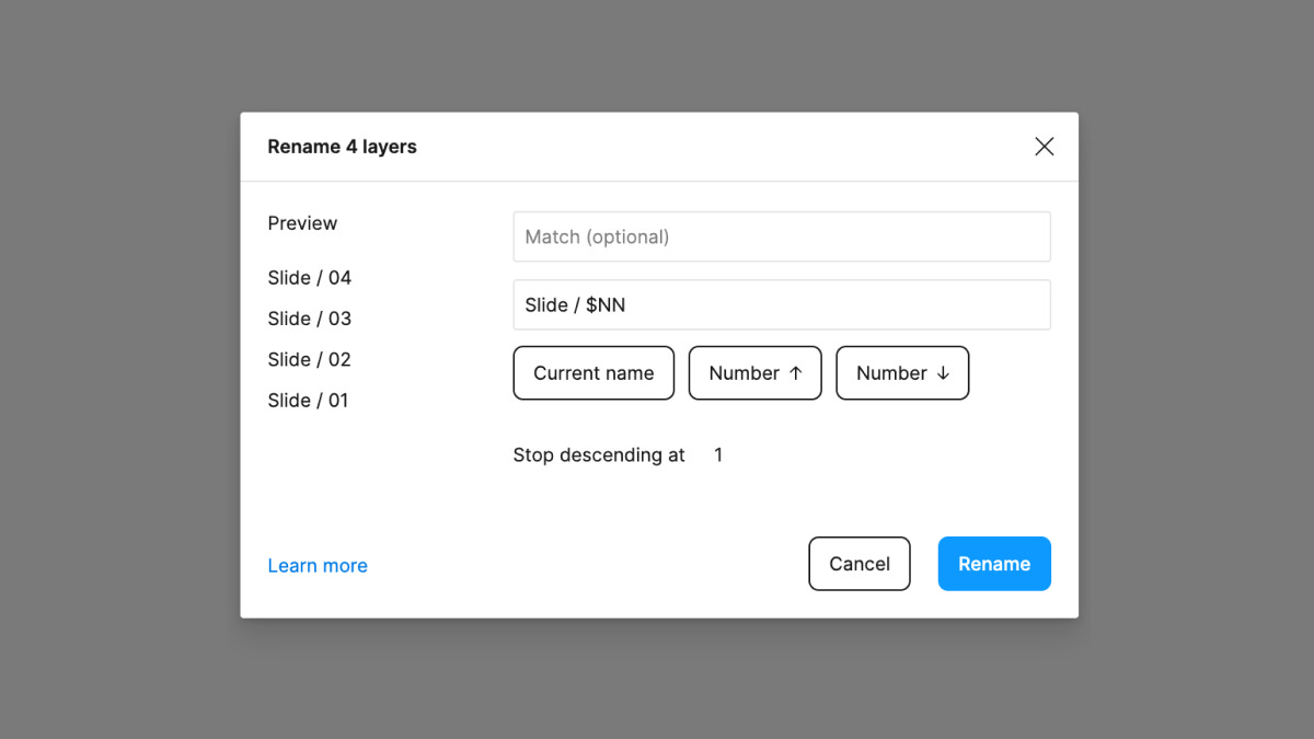
As much as I love to rename and keep my layers in Figma organized, it’s not always the easiest to do, mainly because renaming can be such a tedious task. To help, Figma has a built-in feature that allows any number of selected layers to be simultaneously renamed, and it’s a powerful utility that can dramatically speed up the naming process.
To access this bulk rename menu, all that’s needed is to select the layers you’d like to adjust, and then either right-click on your selection and click “Rename,” or you can tap ⌘ + R, if using a Mac, or Ctrl + R, if on Windows. Within the dialog that appears, Figma provides several helpful options, such as adding a prefix or suffix, renaming all layers to an exact string, or finding and replacing parts of a layer’s name using the Match field. Next time you need to rename multiple layers at once, give this feature a try!
Tip #2: “Select All…”
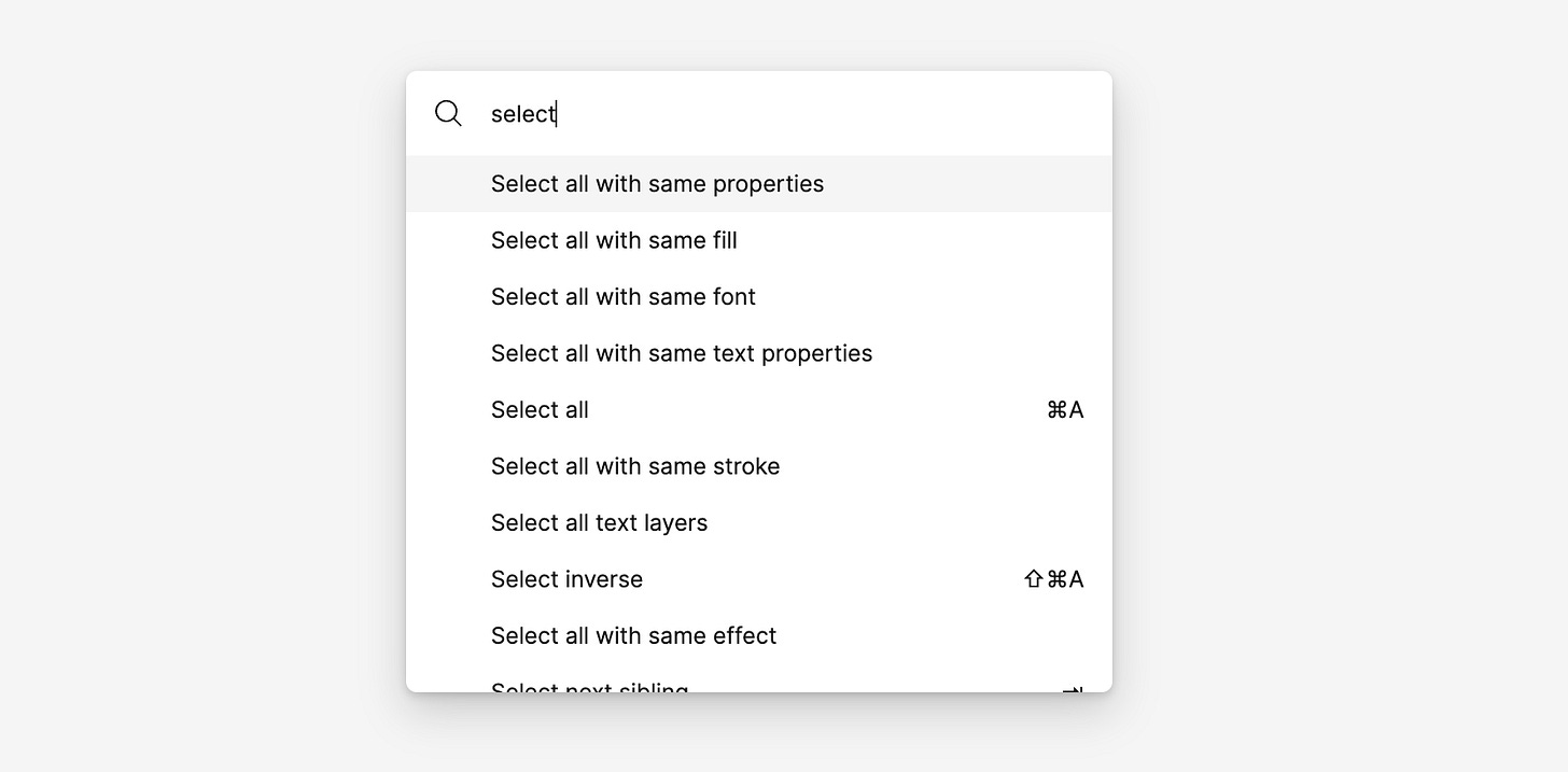
A few years ago, Figma announced a feature called Selection Colors, which allows designers to select any number of objects on the canvas and adjust the various color values. If you haven’t tried this yet, it’s such a wonderful and brilliant feature, but sometimes you may need to select and bulk-adjust properties that aren’t always related to color. Unless components and instances are used throughout the entire file, this can take some serious time.
To help with this, Figma provides users with the option to use several selection queries that can be accessed from the quick actions search bar (⌘ + / on Mac, Ctrl + / on Windows) whenever objects are selected on the canvas. All available selection options appear by opening the menu and typing “Select…”. For example, I recently had a situation where I wasn’t using components (gasp!), and I needed to adjust all size 12 text within a design from a medium font weight to a heavier font weight. Because this option existed, I only needed to open up the quick actions bar and type in “select all with same text properties.” Figma automatically selected every text layer that matched, and I could adjust the font weight for over 100 layers in just a few seconds. It felt like magic.
Tip #3: Spacebar’s Superpower
If you've ever found yourself frustrated with how objects mistakenly enter or exit a frame when dragging them around on the canvas (this can often happen when Auto Layout is used), this tip may help! When moving an object, it's possible to ignore each of the frames it passes over or outside by pressing the spacebar immediately after dragging. It's a simple tip, but this one has helped me so much throughout my daily work of moving those rectangles around.
Tip #4: Private Components
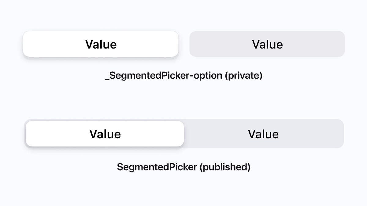
When a new component or style is created within a file that's then published to the Team Library, the new items are automatically made available for anyone who enables that library. This by-default behavior is usually perfect, as it quickly makes adding new items to a component library super easy, but it may not always be what you'd like to happen. For example, when I'm creating atom-level components that help build out the larger and more functional components, I'd prefer to keep the atoms private to the file so that they're not accessed by accident, as they're rarely helpful on their own, just like in the above image. Keeping components private by default can also help if you or your team are working on experimental components that aren't ready for production and won't be for some time.
To create a private component or to move a component from public to private, add either an underscore _ or a period . to the start of the component's layer name. With either that underscore or a period at the beginning, Figma will automatically skip over these components during the publishing process. I prefer to add an underscore, as it's just a bit easier to see, but I love that there are a couple of options to choose from!
Tip #5: Descriptions
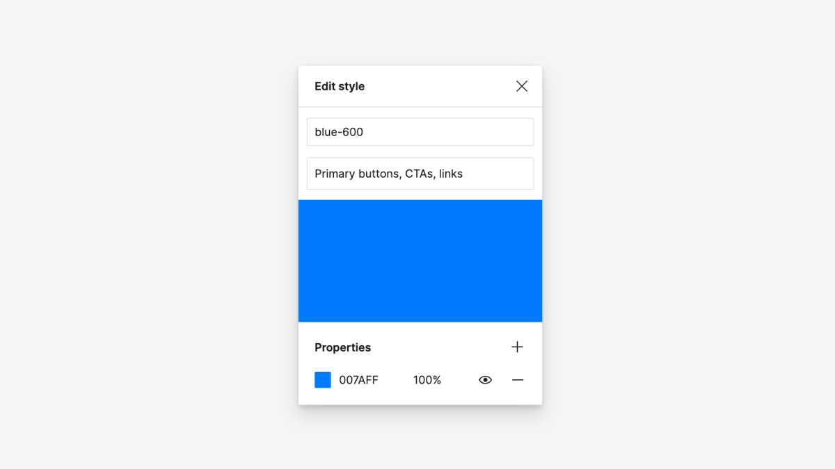
Matching the names of components and styles between what's in Figma and what's in production code can be a valuable way to help designers and engineers more easily find the items they're looking for. However, searching can still be challenging for anyone who's not as familiar with the names. For both components and styles, descriptions can be added, which can be seen by both viewers and editors.
When a description is added, any keywords included for the component appear on hover within the Resources window (Shift + i) or within the Assets Tab. When a description is added to a style, they become visible when hovering directly over the style option from the menu itself. Not only are these a helpful way to identify further information about the component or style that's being used, but these keywords also show up when searching. In the example above, if I were to type in "CTA," this color style would show up due to the word "CTA" appearing in the style's description.
Another way to use these descriptions is for icon components, where an icon may represent different but similar meanings, depending on who is searching. For example, an icon could be named "Gear," but someone may search for "Settings" instead. Without a description, nothing would appear from this search, but with a description that contains the word "Settings," this icon would immediately surface for the designer to use. This can be a handy tool for anyone on the team who's newer to the component library and design system!