New: Variables
To kick off this series of announcements, let’s talk about variables! Support for reusable values within Figma has finally arrived, and it’s been highly anticipated. For designers like myself, working in design systems and component libraries to support their teams and various product initiatives, variables help significantly increase efficiency and consistency throughout your components, designs, and prototypes. Variables are reusable values that can be applied across Figma, unlocking design tokens and easy theming. From representing color or type tokens to storing frame or screen sizes or allowing for easy localization, variables seem to do it all.
Types of variables
At the moment, a few variable types are available within Figma today: color, number, boolean, and string. Before sharing more about those types, I’d love to explain how to view them within your own files for your team to use. When inside a file, click on the canvas so that no objects or layers are selected, or press ESC. Within the right-hand sidebar is a new section called Local variables. Next, click on the control icon to the right to launch the variables modal, where the new magic begins.
Variable type: Color refers to any variable that supports a color definition, and these can be applied to either fill or stroke colors. Even more exciting is that aliasing, which refers to defining one variable that maps to another variable, is available to use. This process allows for the implementation of design tokens and creates a more efficient process when managing updates, as dozens of aliased items can refer to a single variable.
For example, imagine a blue color defined as blue400 for use in primary button backgrounds. A variable called primary-button-bg is then created and maps to blue400. If there’s ever a time when the color value for blue400 changes, all buttons will immediately be updated because of their direct link.
Note: unlike styles, color variables can only support one color per assignment.
Variable type: Number is used to assign a numerical value to a variable’s definition. These variable types can be applied to text layers, corner radius, minimum and maximum width or height, and padding and gap spacing values.
Variable type: Boolean lets us assign boolean values (true or false) to a variable, and in use, can be applied to control layer visibility or variant instances that contain true or false values.
Variable type: String allows for specific strings of characters in any language to be defined and used within designs, such as within text layers or variant instances that contain string component properties. I can quickly see how these variable types will be helpful for those focused on localization efforts and content management within Figma!
Applying Variables
Once created, variables can be applied to their applicable and supported properties within the right sidebar and, if published within Figma, can be used within any file with that particular library enabled. There’s so much more to cover about this new feature in Figma, and I’m already drafting that post! Let me know down below if you’re excited about this new feature.
Tip: with your cursor focused within an input field, press = to quickly access and search through your available variable list.
New: Dev Mode
At this year’s Config, Figma surprised us all with a new experience for engineers using the tool. It’s called Dev Mode, and I think it’s an excellent answer to the team’s question of wondering how a design tool could work better for developers.
For many engineers, entering a Figma file has always been easy, but the previous Inspect Panel was beginning to feel dated when it came time to inspect layouts or export assets. Additionally, because we designers frequently create containers or arrangements that may only be relevant within Figma and not within code, the gap between design and code felt like it was growing. After using the new feature in work of my own, it’s easy to see just how much Dev Mode tightens that space between design and engineering, all while making the experience feel much more intuitive for those engineers in Figma.
Accessing Dev Mode
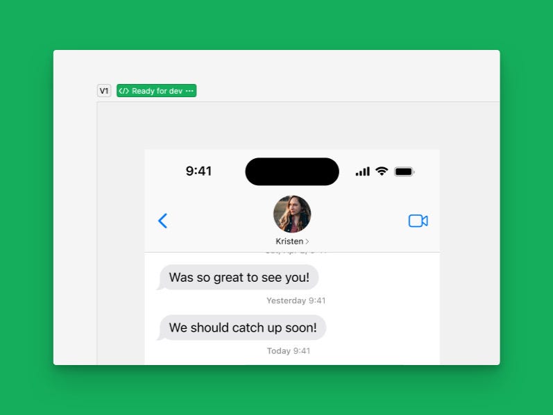
Within any Figma file, Dev Mode is accessible by adjusting the new toggle at the top right of the file or by pressing Shift + D on the keyboard (when sharing a Dev Mode link, viewers are automatically brought right into the new mode). Once enabled, you’ll notice the familiar Figma blue used throughout the canvas interface adjusts to a new green color, helping to make it even more apparent when you’re in the mode and when you’re not.
Navigating designs using Dev Mode
Before Dev Mode, navigating designs was challenging for anyone unfamiliar with the design. It was often unclear which screens were ready for development, and within those screens, it wasn’t always clear which layer to click on to access the correct measurements. Dev Mode makes this much more intuitive, as hovering on objects placed within a design reveals the layer name, and various spacing and variable values appear on the canvas as you mouse around.
When in Dev Mode, a new ready for development section sits atop the Layers Panel. If you’re using Sections within your canvas to organize your various frames and screens, Sections can now be marked as ready for development. When selected, this feature will place an icon next to the page title to more easily let developers know that a page contains designs ready to be worked on, and when viewing within Dev Mode, it will add the section to the left panel, where it’s able to be selected and brought into view with just a click.
Clicking within an area of the design reveals an entirely new sidebar panel, and if a component is selected, the following information (it’s a lot!) is visible:
- The component name, with an action to open directly in VS Code
- Information about when the component was last modified
- A preview of the component in its default state
- Selected variant properties listed as props
- Component documentation
- Dev resources, which may include external links to Storybook, GitHub, Linear, Jira, and other tools
- Spacing and layout measurements, followed by either CSS, SwiftUI, or Compose code snippets
- Color tokens via the used variables
- Assets ready for export, available to download as either an SVG, PNG, JPG, or PDF
- And finally, the ability to create individual exportable assets
Compared to what we had available before within the Inspect Panel, the amount of information here is incredible, and the adjusted interactions for selecting objects on the canvas are so welcome.
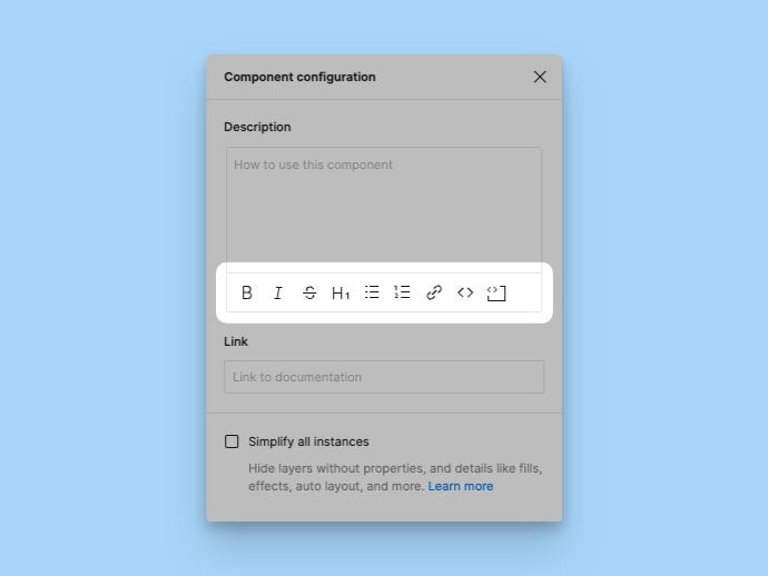
If you use component descriptions to help document your components, you may appreciate the ability to include rich text within component descriptions now. Thanks to Kyle for this find!
Component Playground
There’s so much more to Dev Mode, but I couldn’t end this section without sharing one of my favorite new features, the Component Playground. This feature allows anyone to select an instance on the canvas, and by pressing the ‘Open in Playground’ button within the Inspect Panel, a modal appears, letting you or an engineer explore all possible available combinations of a component without affecting the design. See it in action.
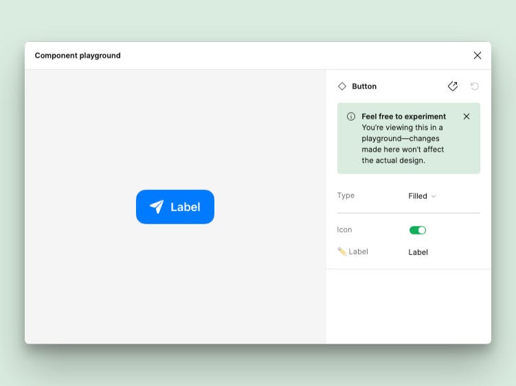
Because engineers need to know how a component functions in various situations, I was previously manually creating frames that visually contained all of these combinatory states, which was such a time-consuming task, so I’m happy to see this is now something that’s built directly into the design tool itself!
New: Advanced Prototyping
There were a few big announcements for prototyping within Figma, too! If you’ve ever tried to make what felt like a realistic prototype in the tool, meaning that the user truly could tap around to navigate anywhere or could adjust the content on the screen based on actions taken, you know just how complex those interactions (or noodles as the team at Figma calls them) can get.
To help, the team at Figma announced several new features to help simplify prototypes and to make more complex ones easier for anyone to create. Prototypes can now contain variables, conditions, and expressions!
We’re beginning to understand how powerful variables are within our designs, but how are they useful in prototypes? Because variables can be of color, string, boolean, or number types, in a working prototype, all of those values can now be swapped or adjusted based on a user’s decisions or interactions. A layer could be shown or hidden, text (such as a shopping cart total) can update, or dimension or size can change. The new Set variable action makes this possible, and you can then apply logic to make the adjustments you’re after.
It’s truly an incredible series of updates, and we’re already beginning to see a few examples of how designers are pushing the new prototyping features to the absolute maximum.
- An example of a stopwatch counting upwards
- An experiment of now being able to type directly within the prototype
- A functioning phone dialer using just one screen
- And finally, of course, Flappy Bird
Updated: Auto Layout
Auto layout, a feature I’ve become so reliant on within my files, also received an update! In the previous world of auto layout, only two possible layout directions were possible: vertical and horizontal. For most cases, these options worked well, but if you were ever attempting to create a component or layout that would support more dynamic layouts, it wasn’t possible to automatically wrap items when the layout’s width either grew or shrunk in size… until now. The ability to set both a minimum and maximum dimension and set the frame’s auto layout direction to wrap is finally here!
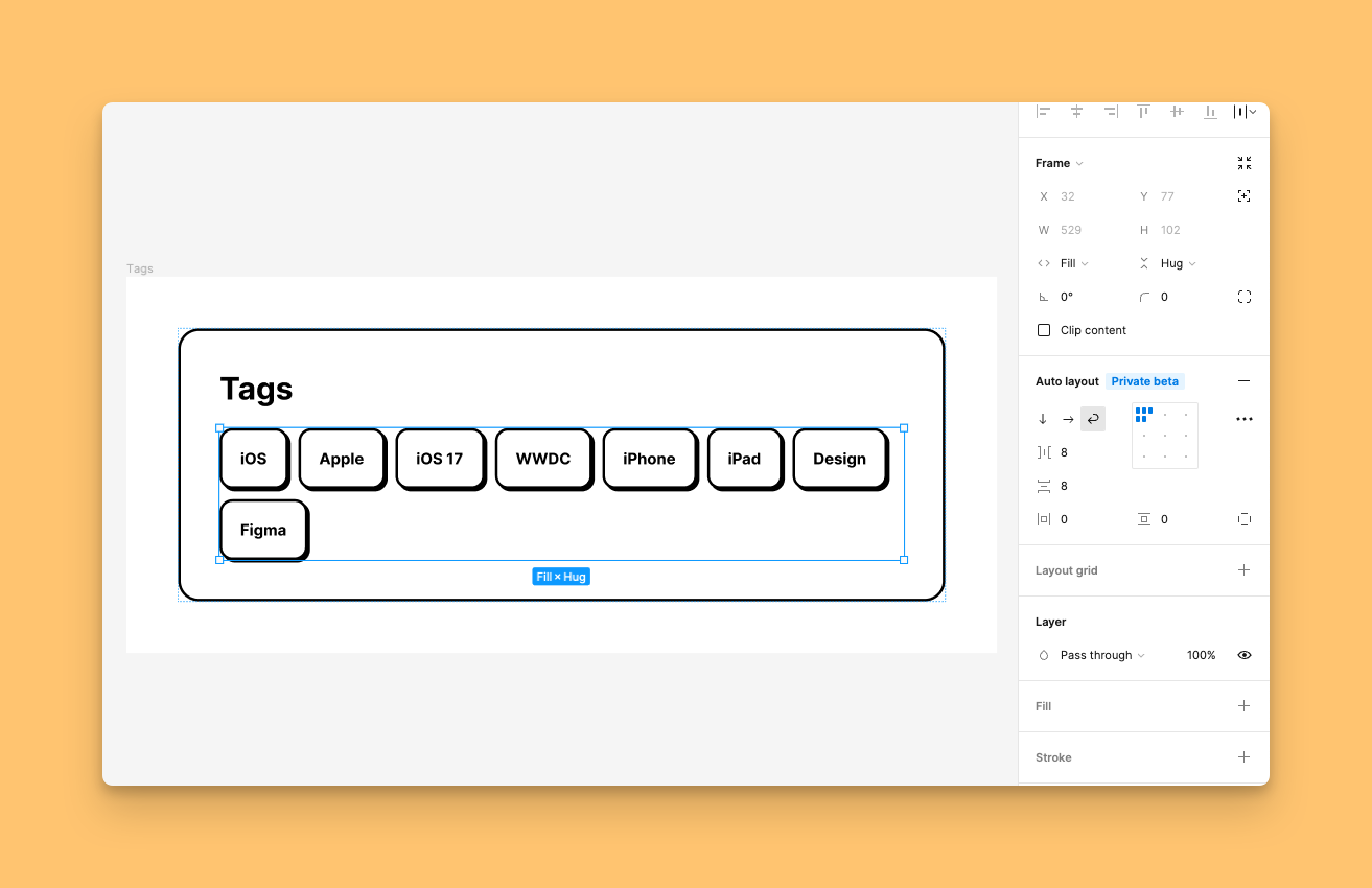
For layouts that may include a grid of images or even tags, like the one above, setting the auto layout direction to wrap is extremely useful. In the above image, whenever a new tag frame is made, it’s automatically positioned to the right of the previous one, and if there’s not enough space within the outer fixed container, it hops down to the following line. Spacing between items, both horizontally and vertically, is customizable, and of course, you can use variables for those values, too!
…and more!
If the introduction of Variables, Dev Mode, and prototyping and auto layout updates weren’t enough, Figma announced a few updates to other features, too! The File Browser received an update to its layout and information architecture to make creating and finding files within the design tool a little easier. There’s also now an updated font picker which makes locating and choosing the right font for the design more intuitive, thanks to updated search filters and font previews — finally!
In case you missed it…

I had the unbelievable opportunity to share the 2023 Config stage with six talented designers in our community, where we shared our favorite Figma tips and features, many relating to the features above. A huge thanks to Helena Zhang, Femke van Schoonhoven, Christine Vallaure, Rusmir Arnautovic, Molly Hellmuth, and Eugene Fedorenko for being so wonderful to work with, and I feel lucky that I was able to get to know you each a little more this past week!
Want to learn more about all that’s new?
I’m continuing to teach everything I know about Figma to others, including diving deep into the tool’s most recent updates. I’d love to work with you! 👋
Originally published: https://joeyabanks.substack.com/p/baseline-13-everything-new-in-figma