
Earlier this month, I shared a change that I recently made when it comes to working and creating components for others to use within Figma. The change? I'm no longer relying so heavily on base components to create published components.
One change I've made when it comes to building components in @figmadesign has been to not rely on base components as often, especially when working with Variants. Adding *only* the relevant layers means less complexity & less probability of a variant option/layer mismatch. 🎛 pic.twitter.com/yZ5brRJm53
— Joey Banks (@joeyabanks) January 12, 2022
If you're unfamiliar with this idea, don't worry! The concept is that base components can help define and enable the structure for an actual, published component to be used by any designer working within the design system. For example, imagine creating a new button component and accounting for all of its possible states, icon placement options, and sizes. Because you're likely to end up with a few dozen variants in total, the idea of needing to one day adjust the corner radius, font, or any other property for all of those variants can feel daunting and even more tedious. When using a base component that's nested within the many button variants, any adjustment only needs to be made within that one component, propagating to all buttons within the design system. Here's what that would look like in Figma's layer panel:
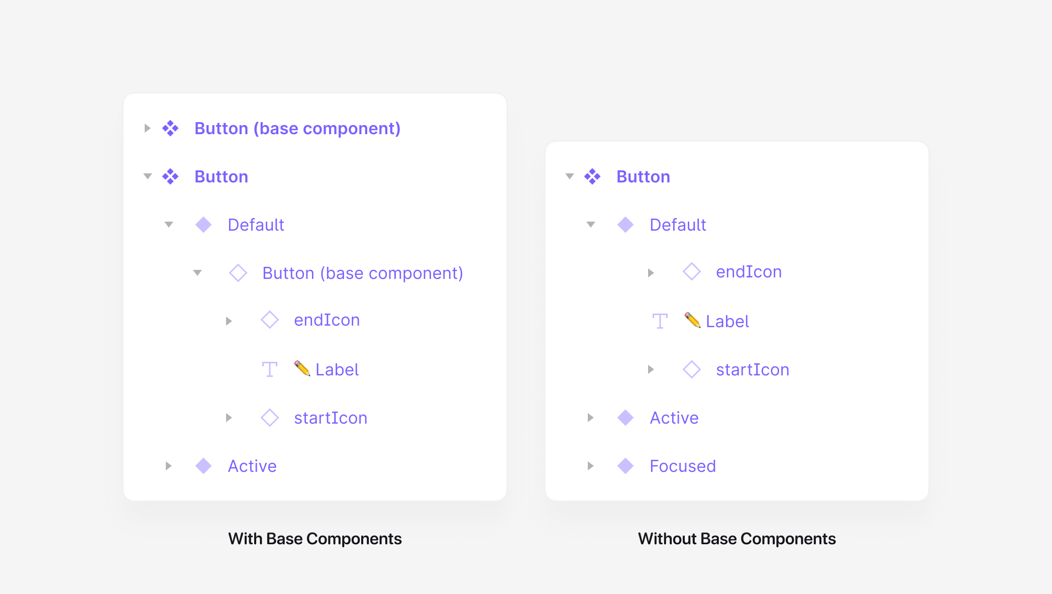
The button component on the left uses base components, while the one on the right does not.
The concept sounds helpful, so why am I no longer using this method as often as I once was? One of the largest limitations of instances in Figma is that it's not possible to add additional layers to them, such as text layers or icon layers. Any additional layers need to be included in the original component, and when working with base components, those layers must be hidden for the component to match its appropriate variant correctly. In the button example above, let's say we create a variant property called startIcon, and it has two options: true or false. If the property is set to true, the startIcon layer would need to be made visible, and if it's changed to false, the startIcon layer would then need to be hidden. What can become quickly complicated is if one of those layers is manually hidden through the Layers Panel, which means what's on the canvas is out-of-sync with the component's selected variant options. This mismatch may confuse designers using the component or developers who rely on Figma's Inspect Panel, where each variant option is displayed.
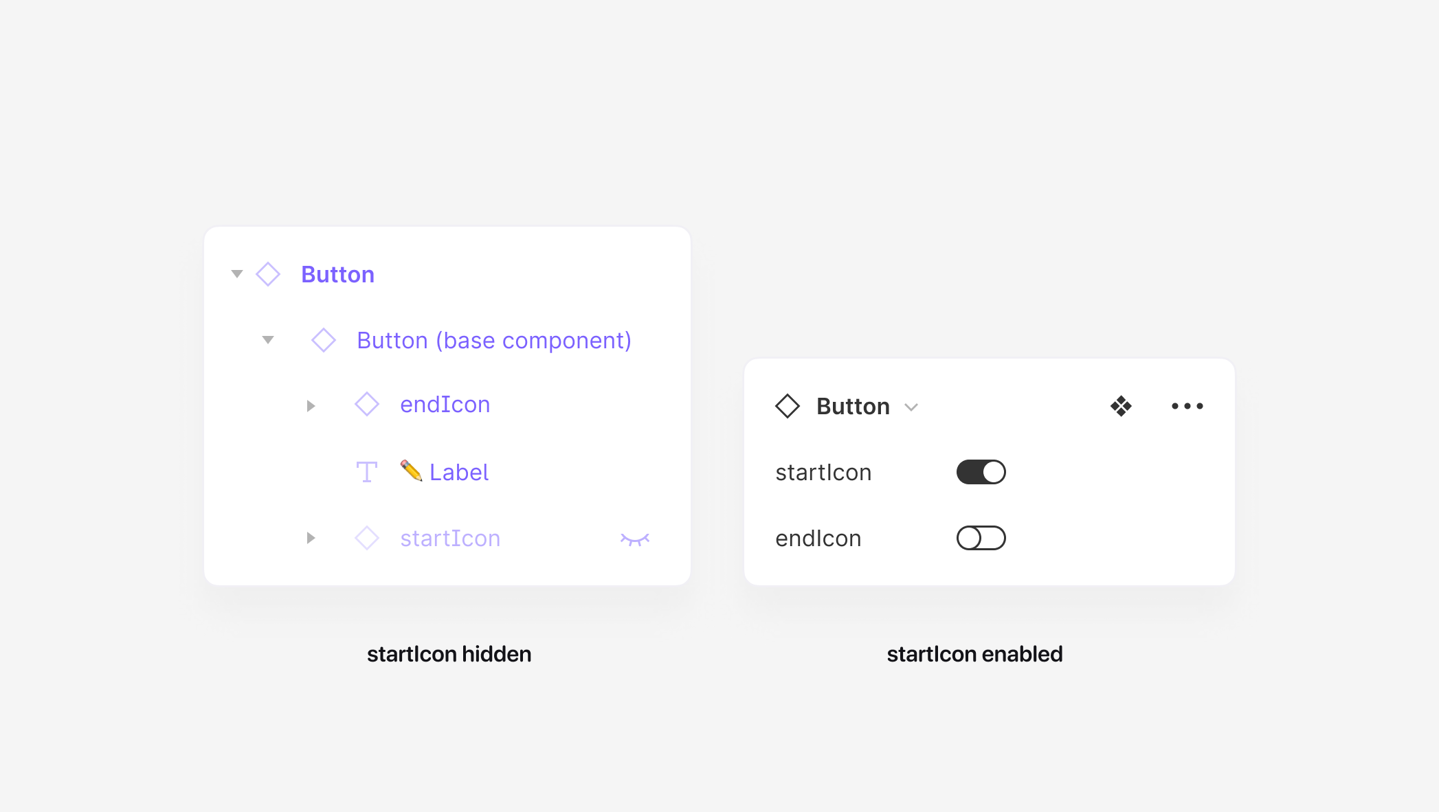
The Button instance has the startIcon hidden in the Layers Panel while the Variant Panel shows that startIcon’s visibility is set to true
Additionally, just like with our button in the example above, for any component, all states must be created through hidden layers within the base component, and this can be pretty tough to both create and manage, especially for ones that are much more complex. In my own experience, this creates tons of upfront complexity and a packed layer panel, possibly containing dozens and dozens of hidden layers. The component could become confusing for any designer using it, as layers can be made visible and more opportunities for mismatches are possible.
Yes, this so so much. Usability over maintainability.
— Jan Toman (@HonzaTmn) January 12, 2022
Jan Toman had a great reply to my original tweet, which in so few words encapsulates the exact thing that's been on my mind: "usability over maintainability." I always want to save myself a bit of time in the future and I’ve been doing that through relying on base components, but the reality is I believe they often create a worse experience for the designers using them. I was always trying to prepare for the day when the corners of buttons would become more rounded or where the typography would change, but in reality, that so rarely happens, and it led me to question if the time spent creating and maintaining base components was worth the time of just making the adjustments, if or when those visual or structural changes did come.
So, I’m curious. If you or your team currently rely on base components, how are they working? If any of the above resonates with you, what techniques have you found that work best to make them easier for everyone to use?